


How do I create a share price graph in Bloomberg?
12/09/2024

One of the simplest – and coolest – things even a beginner can do on Bloomberg is to produce a company share price graph. If you’ve never done this before – or if the very thought fills you with horror – read on. This post will show you how.
The first time we meet the Bloomberg price graph tends to be when browsing through a company’s Equities menu. Find a company first using whichever method you prefer and, from its equities menu, if you use it, select option <GP Line Chart>.
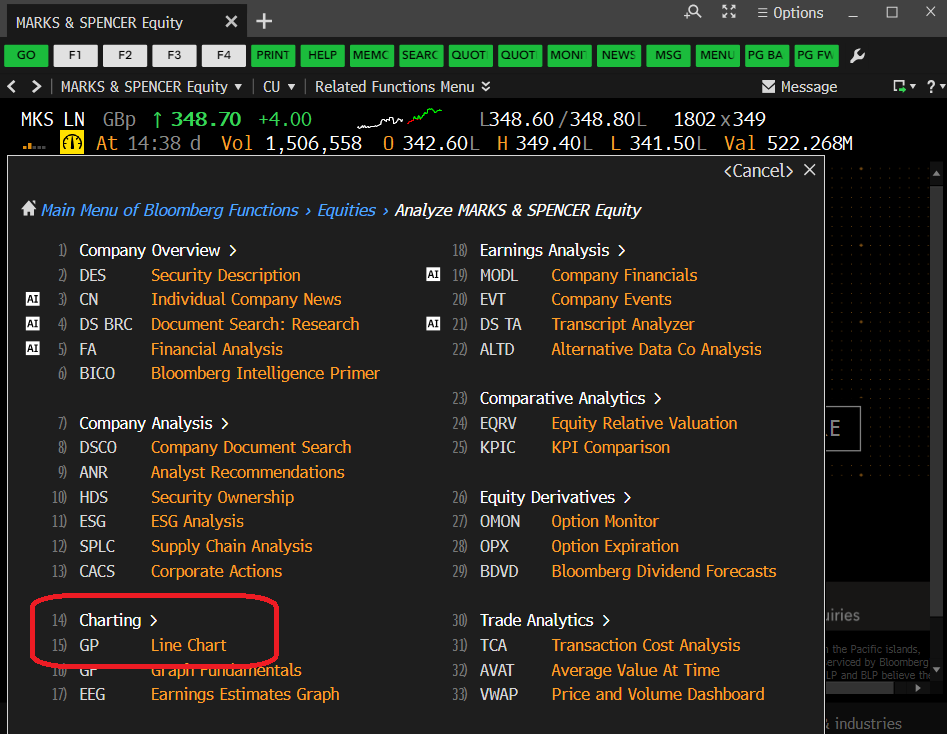
The Bloomberg Equities menu, showing the GP option
Selecting <GP> should take you instantly to a 12 month price chart, looking a lot like that displayed below (well, it should if you’re looking at Marks & Spencer!). The top panel of the graph displays share price and the lower panel indicates the volume of shares traded on any particular date.
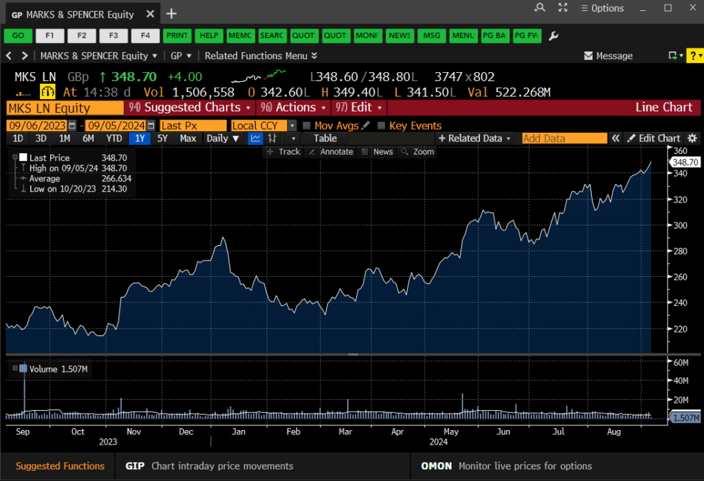
The Bloomberg GP Price Graph
Very nice, I hear you say, but is that it? Well, no, of course it’s not. This is Bloomberg. There are lots of things you can do here to make your chart more exciting or relevant. You can…
- Select another pre-defined time period. Use the options (1D, 3D, etc.) at the top-left of the chart to select.
- Define your own time period. Use the orange date boxes to create your own fixed date range. (NB: In Bloomberg anything in an orange box can be clicked on and edited).
- Add in competitor companies or indices for comparison purposes. Click on ‘Edit’ > ‘Securities & Data’ on the red bar to do this.
- Add in tags for ‘Key Events’ via the on-screen icon. Add your own annotations using the ‘Annotate’ option.
- Bloomberg’s default chart format is a line chart, but those of you who want more detail can change to a candlestick graph or similar by clicking on candlestick icon above the chart.
- Normalise your graph. Give all the datasets a starting value of 100 to track their fluctuations against one-another. See below. Available via the ‘Edit’ function.
- Change backgrounds and line colours from defaults. Edit your chart legend Available via the ‘Edit’ function.
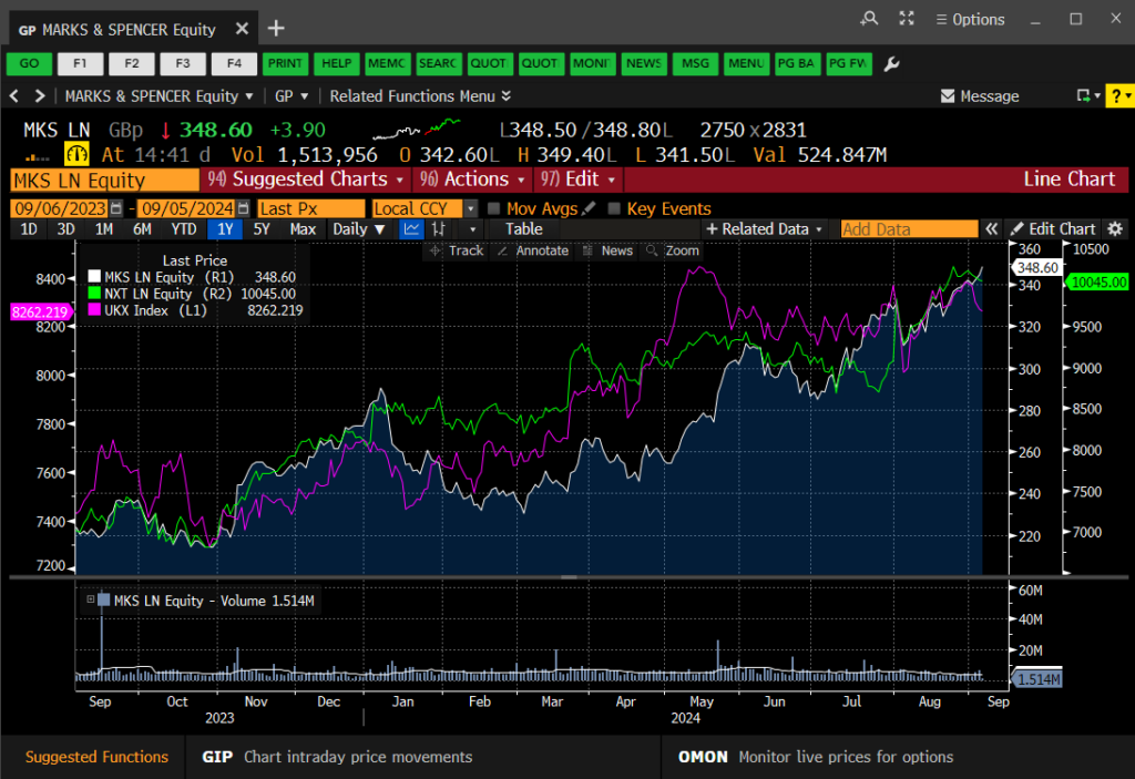
Charting multiple data series in your GP line chart
Once your graph is complete, simply right-click on it and copy the image to the clipboard, then paste it straight into MS Word or Excel. If you would rather download the data behind it, right-click and choose to copy the data instead.
If you’d like to know more, or to arrange a Bloomberg taster session, contact the Library.
Categories & Tags:
Leave a comment on this post:
You might also like…

Building more than research: Reflections from the ECRn Symposium 2026
There’s something quietly powerful about a room full of early career researchers. Not just the ideas, although there were plenty of those—but the conversations, the curiosity, and the sense that everyone is figuring things ...

Library services over Easter, 3-6 April
Kings Norton Library will remain open for study 24/7. You will need your University ID card to enter the building and can use the self-service machines to borrow and return items as usual. Barrington Library ...

How do I access the full-text of Harvard Business Review (HBR)?
This is a frequently asked question, and it's worth knowing how to access this key management journal. So, how do you access HBR in full-text? The short answer is via our eJournals finder. You can find ...

Engineering problem to solve? Let Knovel help you find a solution
Did you know that Knovel provides you with more than just eBooks? Knovel is a key database for many engineering, mechanical and materials courses here at Cranfield University, and contains content from an extensive range ...

What happens when female scholars meet influential leaders?
On the 5 March 2026, our British Council Women in STEM Scholars had the privilege of sitting down with two excellent role models of industry and academia: Professor Dame Karen Holford, ...

From MSc to CEO: Igniting a research revolution
For many, a master’s degree is achieving a big milestone. Kilyan Ocampo, Computational Fluid Dynamics alumni shares how studying at Cranfield helped launch his career in the energy sector. Today, Kilyan ...