


Data Democratisation and the Trouble with Rolling Averages
21/09/2017

I was watching a webinar the other day with various luminaries adding weight to a subtle sales pitch. Two of them were talking about future trends – one claiming data democratisation (Google it!) was spreading like wild-fire and was to be encouraged, while the other spoke about it being a myth. I’m with the latter – and much more in favour of information democratisation. Letting every person and their dog have access to any data so they can interpret it any which way they can – in my view that’s a recipe for much activity, confusion and wasted effort…
Let’s take just one of many examples – the application of moving average charts to data. It is often used to look for trends, cutting out the amount of “noise” (uppy-downy movements in data over time) in the data. Investors use it for example to cut out the ups and downs in trading to see where a certain stock is generally heading – and good luck to them! Those trained in statistics may use these kinds of charts to smooth out seasonality so they can see any signals where data is breaking out of that seasonal pattern.
So what is the effect when we look at some of these charts?
Here’s a 12-month moving average chart of some data (out of context to demonstrate the point):
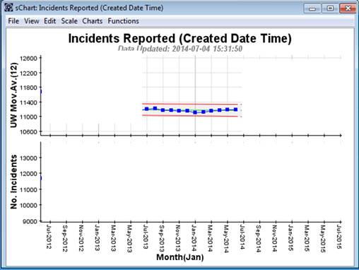
So we’ve got a roughly constant set of results from July 2013 to June 2014 – nothing much going on.
But putting this in context we see a different picture – one that we might want to take action on:
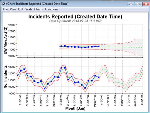
So, in context we see there is a strong seasonal pattern, with high volumes in July and August and low volumes in February! The Moving Average Chart above would look like the same picture if the underlying data were flat rather than seasonal. So the Moving Average loses information about what is actually going on! It does not help in taking corrective action. The extended-SPC chart (showing the seasonal pattern) allows officers the opportunity to focus their efforts when Incident volume is high in July and August in order to have maximum impact.
Here’s another example:
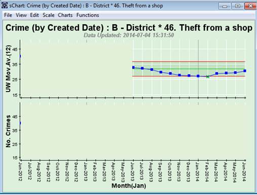
So now we have a signal in February 2014 – something must be special about February 2014. “Find out what happened in February 2014” rattles down from the corridors of power.
But wait up! When we look at the data in context, we see a very different picture:
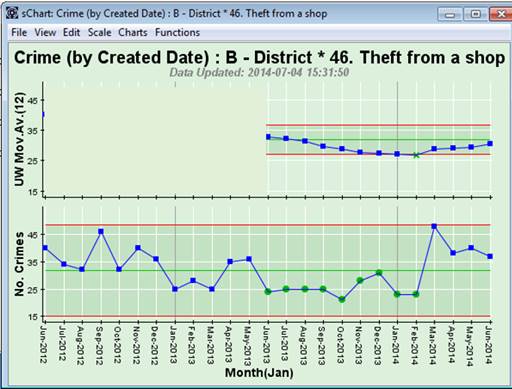
So actually, there’s nothing special about February 2014 at all! February is just part of a run of low results since June 2013 (when actually earlier corrective action was taken by the force to reduce shoplifting). The February 2014 signal in the Moving Average Chart above is actually as a result of the previous high values for months up to February 2014 dropping out of the 12-month moving average calculation! So the Moving Average Chart can be misleading taken out of context – which they usually are!
Lessons Learned:
- Don’t use Moving Average Charts out of context
- Don’t use Moving Average Charts to look for signals of corrective action impact nor for opportunities to apply corrective action
- Recognise that by processing any set of raw data potentially removes information from that data.
- Apply Moving Average Charts only when appropriate.
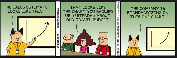
Or alternatively, you could standardise on the one Dilbert chart above – it might be just as useful!
Categories & Tags:
Leave a comment on this post:
You might also like…

Come to a virtual study session in May
What are virtual study sessions? These are online study sessions facilitated by Library staff, where you can study independently alongside other students via Teams. They are a great way for you to dedicate specific time ...

Getting started on your School of Management thesis
Writing a thesis, business plan, internship project or company project can be a daunting task, and you might have some uncertainty or questions around how to get started. This post will share some ideas and ...

Sustainability by royal request: Managing an event fit for a King
The Coronation of King Charles III on May 6th 2023, was watched by millions of people around the world with tens of thousands of people travelling to Central London to witness the pageantry firsthand. ...

Getting started on your Master’s thesis
Please note: This post is intended to provide advice to all students undertaking a thesis in the Schools of Aerospace, Transport and Manufacturing; Water, Energy and Environment, and Defence and Security. There is separate advice ...

Finding your tribe: “Joining the sustainability community was the best decision”
For students on Cranfield’s Sustainability Business Specialist Apprenticeship, community and camaraderie is a vital component for success. Designed in consultation with industry, the part-time Level 7 apprenticeship aims to deepen participants’ knowledge of the ...

“My sustainability studies gave me the confidence to take on Amazon”
Not everyone would have the confidence to challenge a big global power like Amazon but, for Colin Featherstone, Senior Technology Manager and Tech Sustainability Lead at Morrisons, his Cranfield studies equipped him with the ...