


How do I create a share price graph in Bloomberg?
12/09/2024

One of the simplest – and coolest – things even a beginner can do on Bloomberg is to produce a company share price graph. If you’ve never done this before – or if the very thought fills you with horror – read on. This post will show you how.
The first time we meet the Bloomberg price graph tends to be when browsing through a company’s Equities menu. Find a company first using whichever method you prefer and, from its equities menu, if you use it, select option <GP Line Chart>.
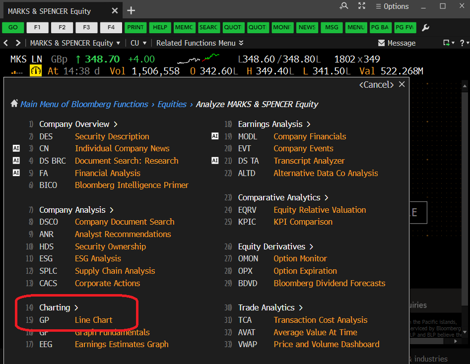
The Bloomberg Equities menu, showing the GP option
Selecting <GP> should take you instantly to a 12 month price chart, looking a lot like that displayed below (well, it should if you’re looking at Marks & Spencer!). The top panel of the graph displays share price and the lower panel indicates the volume of shares traded on any particular date.
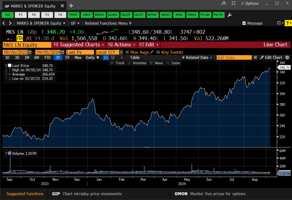
The Bloomberg GP Price Graph
Very nice, I hear you say, but is that it? Well, no, of course it’s not. This is Bloomberg. There are lots of things you can do here to make your chart more exciting or relevant. You can…
- Select another pre-defined time period. Use the options (1D, 3D, etc.) at the top-left of the chart to select.
- Define your own time period. Use the orange date boxes to create your own fixed date range. (NB: In Bloomberg anything in an orange box can be clicked on and edited).
- Add in competitor companies or indices for comparison purposes. Click on ‘Edit’ > ‘Securities & Data’ on the red bar to do this.
- Add in tags for ‘Key Events’ via the on-screen icon. Add your own annotations using the ‘Annotate’ option.
- Bloomberg’s default chart format is a line chart, but those of you who want more detail can change to a candlestick graph or similar by clicking on candlestick icon above the chart.
- Normalise your graph. Give all the datasets a starting value of 100 to track their fluctuations against one-another. See below. Available via the ‘Edit’ function.
- Change backgrounds and line colours from defaults. Edit your chart legend Available via the ‘Edit’ function.
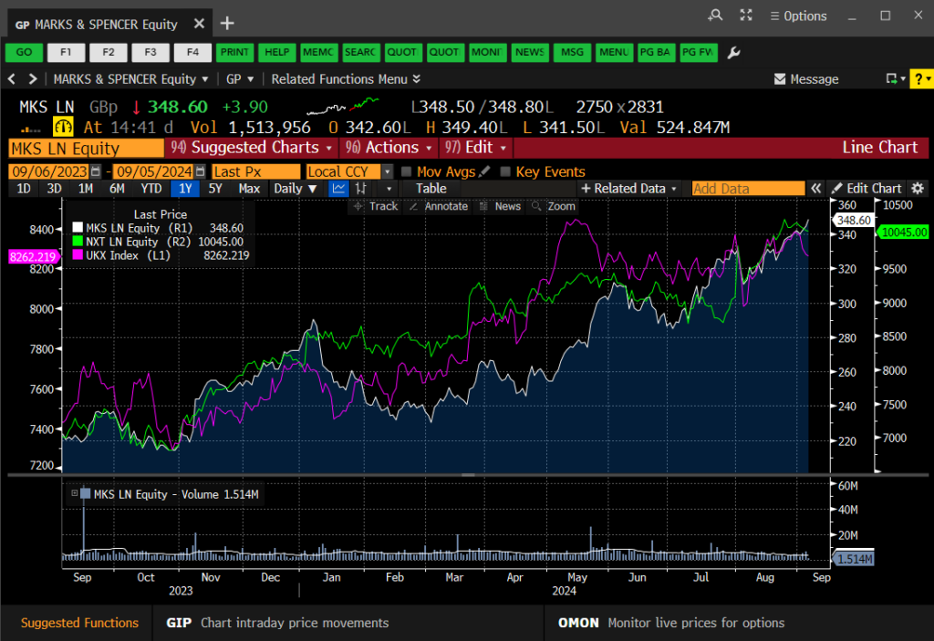
Charting multiple data series in your GP line chart
Once your graph is complete, simply right-click on it and copy the image to the clipboard, then paste it straight into MS Word or Excel. If you would rather download the data behind it, right-click and choose to copy the data instead.
If you’d like to know more, or to arrange a Bloomberg taster session, contact the Library.
Categories & Tags:
Leave a comment on this post:
You might also like…

From nature walks to neural networks: My journey in Applied AI at Cranfield
Hi, I’m Ebru K and choosing a postgraduate degree is about more than just picking a subject; it’s about choosing where your future begins. As an international student from Turkey, I ...

Leading With Heart: My Journey as Cranfield Student Association President by Summer Yan
When I first arrived at Cranfield, I had no idea that one year later I would be standing at the heart of our student community, serving as President of the Cranfield Student Association (CSA). ...

Creating and using constituent lists in Datastream
Whether you're analysing industry performance, or comparing company financials, Datastream is a powerful tool. One of its most useful features is the ability to work with constituent lists — collections of companies grouped by index, ...

Landing at Cranfield: First-term experiences and life beyond the classroom
Starting a postgraduate course can feel daunting, especially if you’re new to the aviation industry. In this blog series, Adit Shah shares his journey on the Air Transport Management MSc at Cranfield. From first-term ...

Accelerating ambition: How Amelie Rohan engineered her future at Cranfield
In the world of high-performance automotive engineering, the gap between being a “fan” and being a professional is measured in more than just miles. It is measured in technical precision, hands-on ...

Study better and smarter in 2026
Happy new year! Now is the perfect time to reflect on your studies so far, thinking about what you’re doing well and where you need to focus a bit more attention. Getting back into ‘study ...