


Performance Reporting Measures vs Performance Management Measures – Part 5
07/02/2020

Sophisticated Statistical Treatment of Measures – Part i
You may have read my previous blogs comparing Performance Reporting Measures vs Performance Management Measures.
Performance reporting is littered with measures that may appear to carry meaning for some people, but in our observations, have been misleading and impenetrable to many. And certainly don’t help understanding nor how to improve!
Here are some examples of reporting measures that we introduced previously:
- % items completed: % implies a ratio – with a numerator and denominator. E.g. % Repairs Completed defined by (Number of Repairs Completed / Total Number of Repair Calls) * 100
- % completed within some timeframe: E.g. From a previous blog’s A&E Figures, we saw % A&E attendants seen in 4 hours or under.
- Complicated Measure Combinations: E.g. % Forecast Accuracy in Supply-chain
- Applying sophisticated statistical treatment to raw performance measures that only stats specialists can read: E.g. Exponentially weighted moving averages
- Statistical representation of a population of people or things: E.g. Electric Car Use by Country
This week we’ll look at some examples of the sophisticated statistical treatment of simple performance measures. You’ll probably have some examples of your own.
So we already know from our previous 4 blogs on this subject that % measures present problems, and measures that use % success within a constraint (usually time) / target inhibit understanding, and complicated measure combinations are dangerous – so we’ll not revisit them here.
So why can the sophisticated statistical treatment of simple performance measures confuse or mislead?
We’ll only consider two examples of more sophisticated statistical analysis here for brevity, and we’ll possibly over-simplify our explanations, since most readers, we would imagine, are not stats experts:
- Correlation Analysis
- Weighted Moving Averages
A good rule of thumb – the more complex the algorithm applied to one or a combination of simple measures, the more distant the reader becomes from being able to assess what is actually happening in a business process or system, and thus does not aid improvement! So, although some of these algorithms are very clever, they were designed for purposes other than understanding how to improve a process or system.
Correlation Analysis
Let’s first, then, consider correlation analysis. And we’ll just look at the simpler linear regression (multiple regression is more sophisticated / complicated again).
Why is correlation analysis useful? Well, a simple example might be that we want to see if our Government spends £20bn a year more on the NHS, we want patient experience (such as number of scheduled operations) to increase, or if they add 20,000 more police, then we’d want to see some sort of result (which may, for example, be less crime, greater feeling of public safety, or more crimes resolved (let’s crudely say detected)), or if we change manufacturing batch-size do we see a reduction in inventory and reduction in throughput time.
Here’s an example:
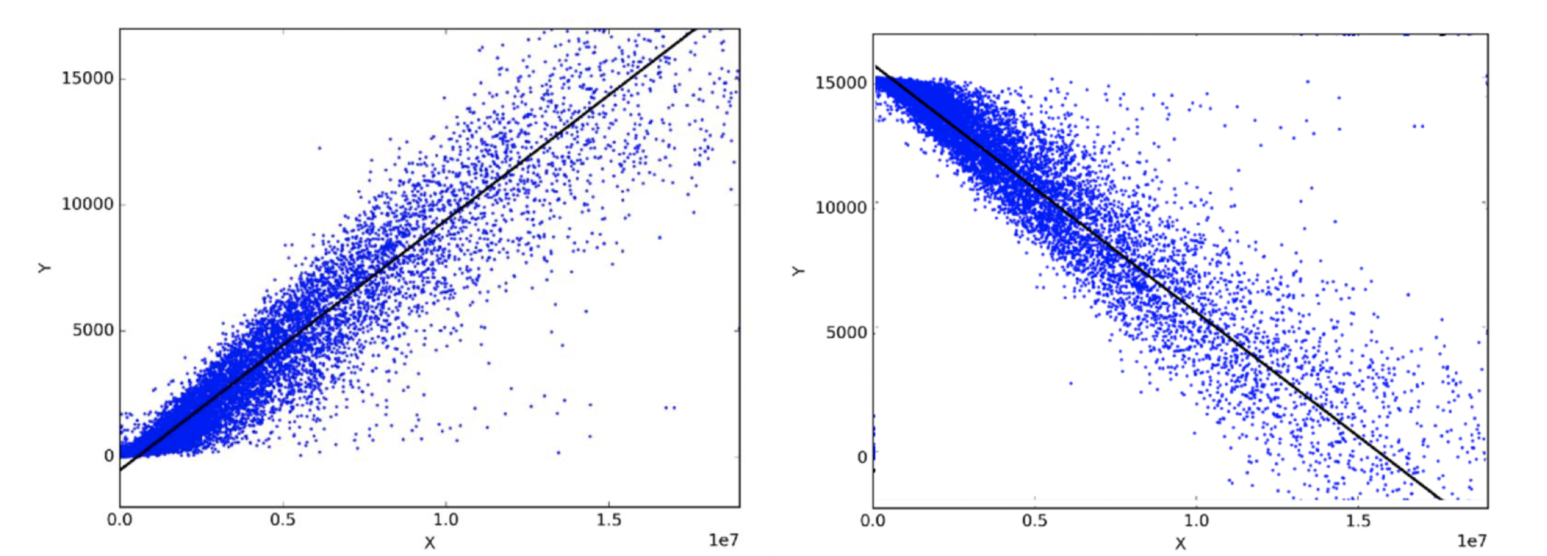
We usually see a horizontal axis (X-axis) and a vertical (Y-axis), a collection of dots (or scatter plot) on the page and a straight line drawn through them. And then the statistical test will produce something known as Pearson’s coefficient which can range from -1 to +1. If, as in the diagrams above, a straight line can reasonably be drawn with a similar number of dots on each side of the line, at roughly the same distance from the line, then a reasonable level of correlation is present. The closer the correlation coefficient is to +1, the more strongly positively correlated the two variables (X and Y) are and we are led to believe that as X gets bigger then so does Y. The closer to -1, the more strongly negatively correlated they are (i.e. as one goes up, the other correspondingly goes down). So the chart above on the left shows strong positive correlation, the chart of the right shows strong negative correlation. And if there is only weak or no correlation, then the correlation coefficient is close to 0.
But there’s a problem, two problems actually, with quoting correlation out of context:
i. The problem associated with quoting a correlation value, without showing the scatter plot
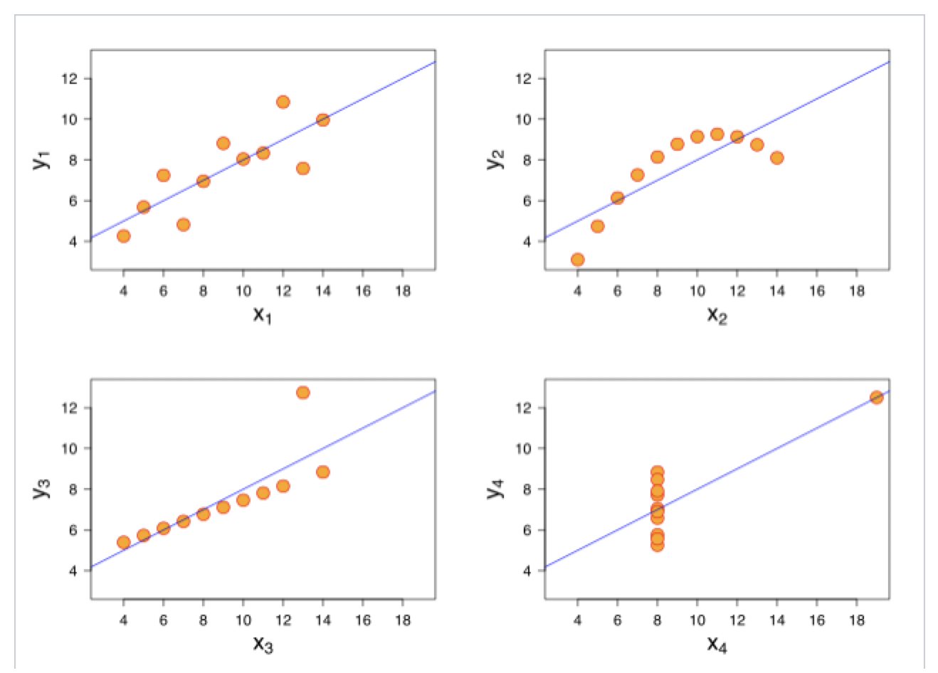
This is illustrated by Anscombe’s Quartet, which is well described in Wikipedia:https://en.wikipedia.org/wiki/Anscombe%27s_quartet
It turns out that the correlation coefficients between the X variable and the Y variable for all four charts below are the same! Yet, you can plainly see that each one of the scatter plots (or we could say distributions) is vastly different from any of the other three!
So, for example, someone saying there’s a strong negative correlation between increasing GDP and reducing Employment, without showing you a scatter plot – well, you may just want to be a tad sceptical!
ii. Missing sense of time
For those wanting to make improvements to systems and processes, this is a much more vital issue!
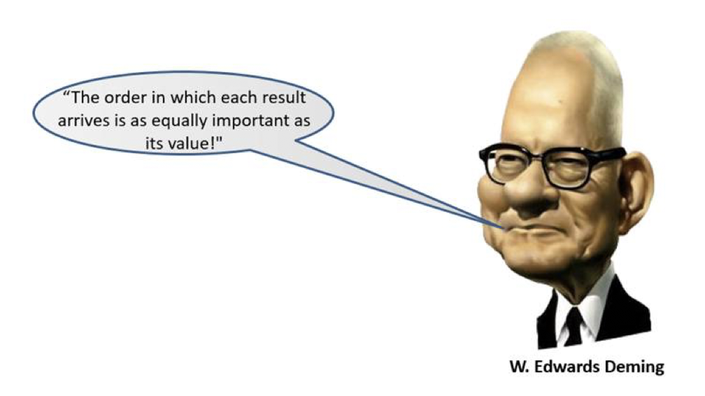
There is no sense of time – meaning we have no idea of the order in which all the blue dots in the first diagram above (or the orange dots immediately above) arrived! And anyone who knows anything about system improvement will know what W. Edwards Deming (the father of system and process improvement) said:
So, without (let’s call it) Time-series correlation analysis, you have no idea with a scatter plot and a Pearson coefficient of, say, 0.75, whether the variables started off strongly correlated and then diverged; started off divergent but then became more closely correlated; started highly correlated, diverged for a while, and then converged! It’s crucial to know these things when improving systems and processes.
So we recommend using this technique which we refer to as Time-series correlation, and this is how it works:
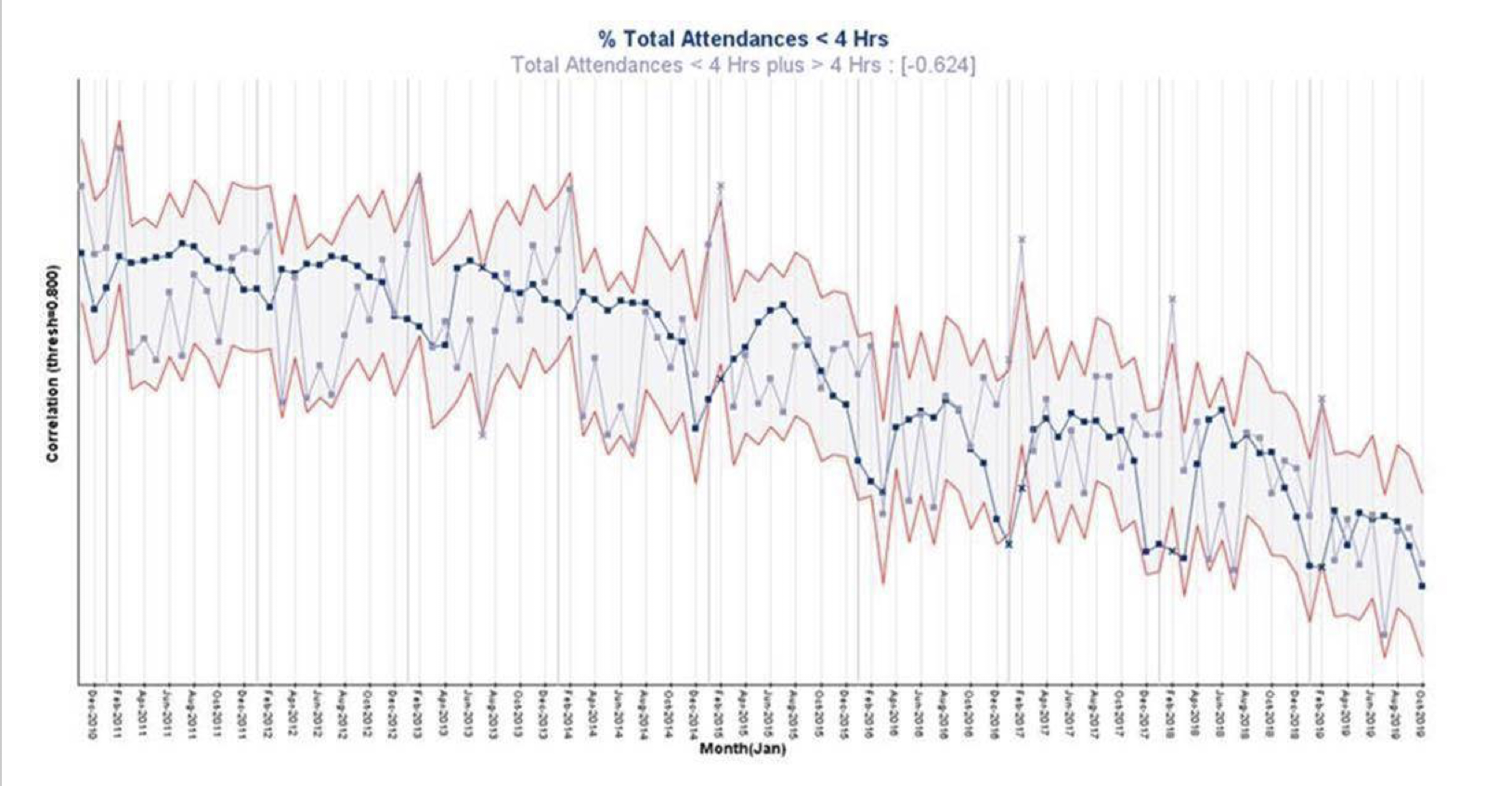
We illustrated this Time-series correlation chart a few blogs ago when questioning how throwing more money at the NHS would improve it! The Time-series correlation chart above shows TIME along the X-axis, and the Y-axis shows the STRENGTH OF CORRELATION. The upper and lower red guidelines in this case show the threshold (+0.8) for strong positive or negative correlation over time. And the points in blue are (normalised) % Total Attendances In Under 4 hours, while the grey points are the (normalised) Total Volumes of Attendants. The correlation coefficient is -0.6 indicating medium strength negative correlation, i.e. as the Total Volumes increase, the % Total Attendances In Under 4 hours decreases. The points outside the upper and lower red guidelines are the months where the correlation threshold is broken. So we can see that for 4 Februarys out of the past 5, the Total Volumes were well outside the usual correlation, while the % Total Attendances In Under 4 Hours also shows 4 signals of non-correlation below the lower guideline.
For those who say we need more staff (i.e. money) this may be of some use, but a major question arises – why did these spikes only start around February 2015. I think I’d like that answered, along with some others, first before assuming it’s a money problem! With a classic scatter plot, you can’t start to ask questions like this.
HEALTH WARNING: CORRELATION DOES NOT EQUAL CAUSE & EFFECT, IT ONLY OFFERS UP CANDIDATES FOR CAUSE AND EFFECT WHICH CAN THEN BE TESTED IN CONTROLLED EXPERIMENTS!
I would suggest that looking at data this way would definitely make Dilbert a lot happier!
We’ll use the next part in this series, to look at Moving Averages and why they can throw up unwelcome surprises to the uninitiated! Dilbert would be underwhelmed!
Categories & Tags:
Leave a comment on this post:
You might also like…

Referencing the use of generative AI in your work
We recognise that Artificial Intelligence (AI) has, and will increasingly, become a part of our everyday lives and that we need to adapt to it. Hopefully you will have already seen the guidance for staff ...

Finding part-time work whilst studying at Cranfield – is it right for you?
We know that the cost of living in the UK is a real and ongoing challenge for many students. Whether you are still considering postgraduate study or already preparing for life at university, you ...

Leaving Cranfield soon? Have you heard about Alumni Library Online?
We are proud to offer one of the UK’s leading university library services for alumni. Alumni Library Online gives you instant access to thousands of top quality journal articles and the latest thinking to support ...

Want to know more about research methods?
Research methods are the strategies and tools used to gather, analyse and interpret data or evidence to uncover new information or create better understanding of a topic. Research methodology is the theory, justification and assumptions ...

Come for Cranfield, stay for Milton Keynes: how Bucks, Beds and the OxCam region are just getting started
Heard the one about the entry-level job that needed three years of experience? Sadly we all have, and that’s why in a jobs market where practical, hands-on experience is so important, study where collaboration ...

British Standards and ISO standards demystified
We are frequently asked how to find ISO (International Standards Organisation) standards. The best way to find them is to go straight to our British Standards Online (BSOL) service. Why go to British Standards if you ...