


Performance Reporting Measures vs Performance Management Measures – Part 6 of 6
04/03/2020

You may have read my previous blogs comparing Performance Reporting Measures vs Performance Management Measures.
Performance reporting is littered with measures that may appear to carry meaning for some people, but in our observations, have been misleading and impenetrable to many. And certainly don’t help understanding nor how to improve!
Here are some examples of reporting measures that we introduced previously:
- % items completed: % implies a ratio – with a numerator and denominator. E.g. % Repairs Completed defined by (Number of Repairs Completed / Total Number of Repair Calls) * 100
- % completed within some timeframe: E.g. From a previous blog’s A&E Figures, we saw % A&E attendants seen in 4 hours or under.
- Complicated Measure Combinations: E.g. % Forecast Accuracy in Supply-chain
- Applying sophisticated statistical treatment to raw performance measures that only stats specialists can read: E.g. Exponentially weighted moving averages
- Statistical representation of a population of people or things: E.g. Electric Car Use by Country
This week we’ll look at the statistical representation of a population such as Electric Car Use by Country, Knife Crime by London Borough, incidence of cancer in patients over 70 by county and so on.
Here’s an example of how Electric Car Use by Country looks:
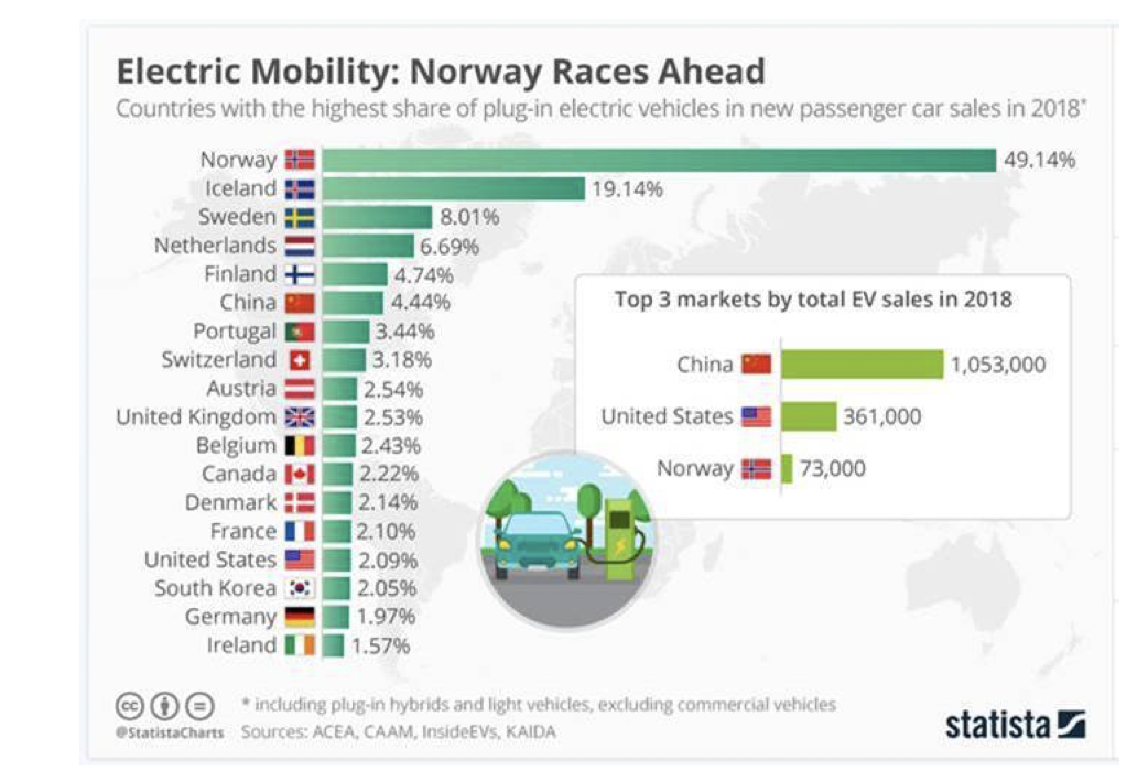
There is nothing wrong with this measure, nor the way it is represented in the chart. However, this chart does nothing to assist the understanding of how quickly each country has reached its certain percentage above, nor if it’s going up or down, impact (if any) of government incentives or social pressures or what is likely to happen in the future.
What is missing is the time dimension.
And rather than switching to a more appropriate chart to aid understanding, determine potential drivers, and look for improvement, we often get hit with bastardised diagrams such as the one below:
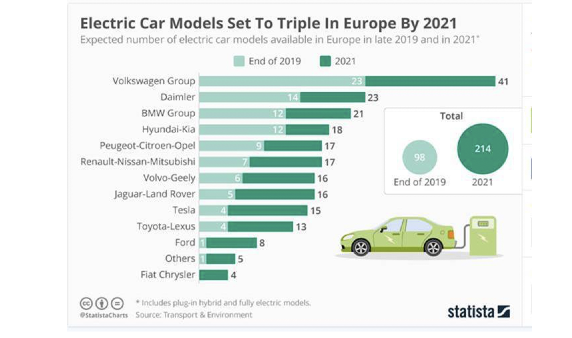
Which serves up binary comparison (result for one period vs result for another period) – and we’ve blogged about the dangers of binary comparisons in the past – in this case the population by Manufacturer of the no. of electric models in 2019 vs 2021.
But going back to Norway, where everyone is getting excited about government aims of zero emissions by 2025, we can see a reasonable representation of the growth of Electric Vehicles over time using a bar chart rather than a time-series chart. We can clearly see how electric vehicles are taking off. And it looks like it started in 2011.
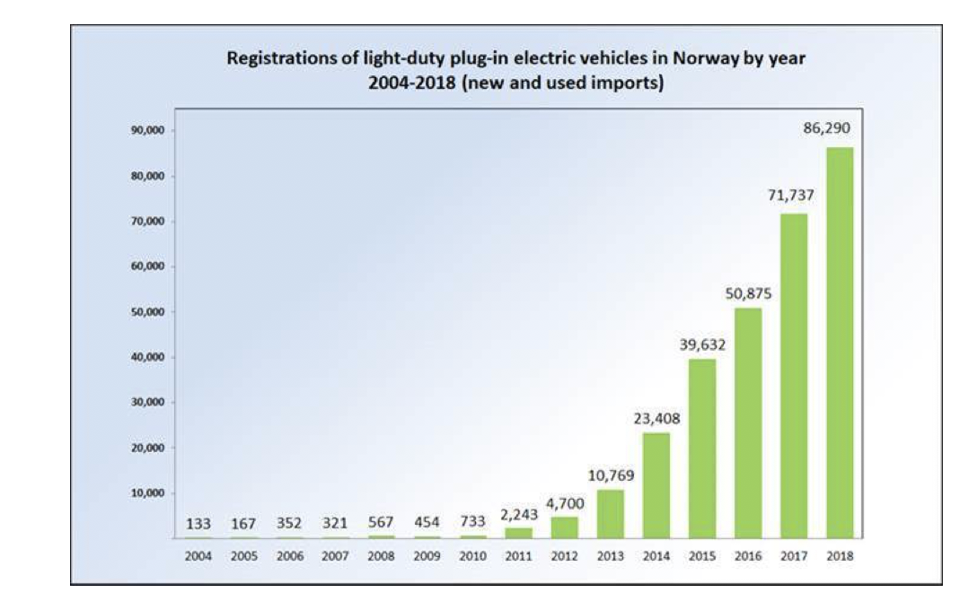
BUT! It is very difficult to see if the increase is still accelerating, or starting to flatten off and if it is flattening off, when and why?
Another problem with looking only at annual figures in this way is the impact of efforts by the Norwegian government to drive EV take up. There were apparently incentives in the 1990’s but obviously then finding an electric vehicle was rather difficult! These incentives included EVs being exempt from things like Purchase Tax and VAT, and these incentives were extended in 2015. EVs can travel in bus lanes, and can access free parking in cities. The government is now considering removing some of these incentives. It is not at all easy to see when these incentives made an impact on sales figures, nor what may happen if they are removed!
Looking at these figures in a time-series chart, the interesting story is that since 2013 the increase in EV sales is about 15,252 per year, with the sales in 2018 reaching 86,290. And now we can “forecast” forward to 2025 when the government has stated zero emissions only.
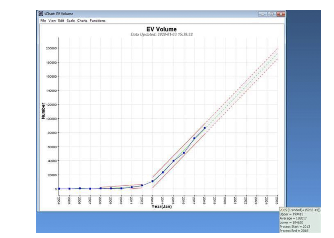
By the end of 2018 a total of 300,000 EVs are on the road, and if the trend continues, by 2025 over 1.3m EVs will be roaming Norway. But the government is looking to remove EV incentives imminently. The time-series chart will be the more sensitive in visualising what impact this may have on EV sales.
And we do talk about presenting figures in context, so not to flatten all the excitement around EVs in Norway, here’s the population breakdown of vehicle types in Norway at the end of first calendar quarter of 2019.
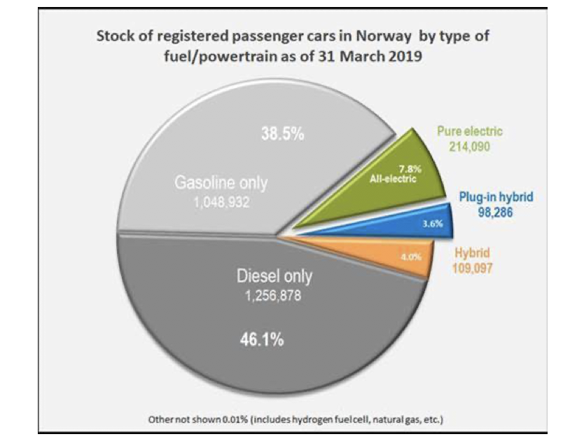
So, approximately 300,000 EVs in a total population of passenger vehicles of 2.7m (11%) at the start of 2019. The time-series chart above projects that by the end of 2025 there will be around 1.9m EVs on the road. But it is difficult to get figures about the overall increase in demand for passenger vehicles as a whole, and about the projected growth of gasoline and diesel passenger vehicles in particular! So, zero emissions by 2025 is a great aim, but in practicality it looks a little bit of a challenge to me!
In summary, population distributions are fine as far as they go, but without a sense of time, they are of little use in understanding system and process behaviour, or how to effectively go about system and process improvement.
Put them together with context and time – that would keep Dilbert happy!
Categories & Tags:
Leave a comment on this post:
You might also like…

Driving the future of automotive excellence with three new scholarships
Cranfield University has a long history within the top echelon of motorsport, car development and safety designs within the automotive industry, working in the era where we’ve seen significant safety improvements, engineering feats and ...

Academic writing and being critical
Academic writing is daunting. Capturing all your thoughts and analysis and putting them down onto paper in some sort of understandable fashion is a challenge. Did you know we have resources in our Cranfield Study ...

My Cranfield experience: How studying for the Strategic Marketing MSc landed me a job in my dream industry
For Shraddha Mahapatra, studying for a postgraduate master’s degree at Cranfield School of Management unlocked the path to a career working in her dream industry sector. Shraddha had gained an MBA in her native ...

Keen to develop your study skills?
Alongside the technical skills and academic knowledge that you will gain on your course, as a Cranfield student you have the opportunity to develop a range of other skills that can enhance your learning experience. ...
From classroom to reality: Supply chain insights from Cranfield’s Manchester study tour
Each year, Cranfield University organises a study tour for MSc Logistics and Procurement & Supply Chain Management students. For the 2025–2026 cohort, students were given the option to select one of three study groups: ...

Systematic literature review – Managing duplicates
One of the questions which often comes up when discussing the SLR process is how do I manage my references in the most efficient way during the process of going from my search results to ...