


More Money – Simplistic Solutions to Complex problems!
20/11/2019
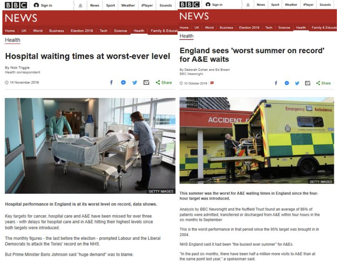
Last week we heard and read about NHS A&E Wait Times being the worst ever! Just as we heard the same thing in October and last year and the year before that and, and, and …. All out of any context whatsoever!
And out come the leaders of every political party offering simplistic solutions – spend more of our money on more staff for the NHS – problem solved! Or is it?
Let’s look at the facts from the Office of National Statistics (the best unbiased data accessible to the public). Here’s a chart of the Wait Times (data goes back to November 2010) that the BBC are quoting from:
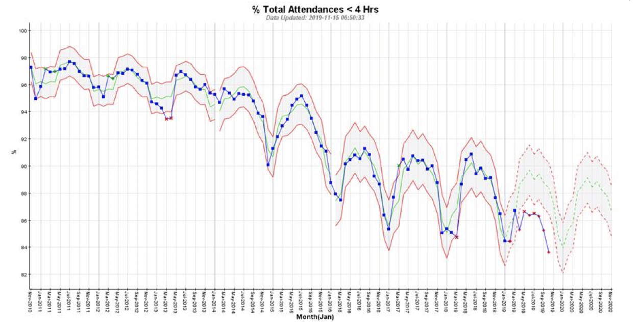
The actual data is in blue, and the trend and pattern formed is described by the seasonal (higher in the summer months, lower in the winter months) trended average (green line) and the upper and lower red lines. The pattern from November 2010 to January 2014 shows they were just about hanging onto the target of 95% (to be seen in 4 hours or less).
From January 2014, things took a turn for the worse – the seasonal downward trend became a lot more exaggerated. WHY? And the arbitrary target of 95% was only met during a few summer months in 2014 and 2015.
And from around January 2016, the trend and pattern changed, but continues to be seasonal and trending downwards. This pattern and trend have been maintained up until the April 2019 (red x), and since then has been even worse than the established downward seasonal trend ever since (more red xs). Incidentally, the red x in March 2018 was when the so-called “Beast from the East” struck. You’ll see this wasn’t due to increased attendances (see chart below), but is more likely to be because some medical staff couldn’t get to work in the snow.
What does this tell us? It begs the question as to what happened to cause the downward trends starting in 2014 and continuing in 2016?
Some politicians are blaming increasing patient numbers, some are blaming lack of investment. Let’s see.
Here’s the chart on patient numbers (and it seems these numbers are lower than the raw numbers coming in, presumably because some people see the length of the wait and leave without seeing a medical person? ):
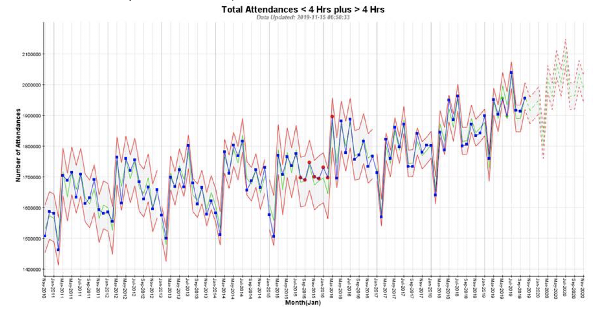
Same as the chart above, the actual data is in blue, and the green average and upper and lower red guidelines outline the seasonal upward trended pattern. There are 4 separate (November 2010 – December 2012; January 2013 – December 2014; January 2015 – December 2016; January 2017 onwards) but similar upward trending seasonal patterns and the latest, starting around January 2017 is trending upwards at around 6,000 per month, on total numbers of attendances seen of around 1.7m – 2.0m people per month (or approx. 0.3% increase per month). This may seem miniscule, but equates to an increase in the average of around 72,000 (almost 4%) more attendances over a 1 year period. Is this increase (along with the previous upwards trends) enough to tip Wait Times over the edge?
What does the correlation look like between number of attendances seen vs the Wait Times.
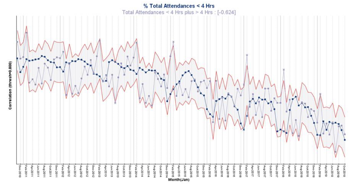
The negative correlation indicates that as the Number of Attendances has increased, the % Attendances seen in 4 hrs or less has decreased. However, this is only a moderate negative correlation (-0.6), meaning there may be something else driving the increasing Wait Times.
The politicians talk about investment, so an obvious thing to look at is the number of staff, and here’s the chart below:
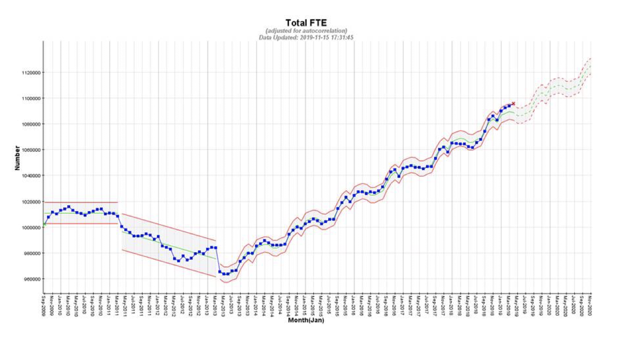
The data available is the total Full Time Equivalent (FTE) number of employees from September 2009 through April 2019. The data is in blue, but the patterns (red upper and lower guidelines) are more important. The first portion of the chart (September 2009 – March 2011) shows FTE numbers as stable averaging around (green line) 1.01m. Then, from April 2011, they started dropping at a rate of about 900/month until April 2013. From this point on, the FTE numbers have been trending seasonally upwards at around 1,710/month (over the past year this is about 0.15%/month).
And the red x for April 2019 indicates an unusual increase beyond the seasonal trend – perhaps the start of more rapid recruitment – further data is required before jumping to any conclusions on this!
It’s always suspicious to see sudden changes at the start of a financial year as this smacks of changes to counting rules. However, taken at face value, could the reduction in FTEs over 2011, 2012 and into 2013 have caused the whole NHS A&E system to fall over into the ever worsening state from early 2014 onwards? And could it be that the increasing FTE rate from early 2013 has just not been able to keep up with the faster increasing demand rate to enable the system to recover?
However, the correlation between increasing FTEs and Wait Times looks like this:
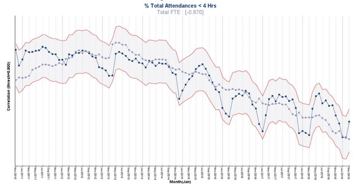
This is a strong negative correlation indicating at face value that the more FTEs the worse Wait Times are!
The problem is seriously complex, and politicians promising more of our money (i.e. FTEs) may not be the complete answer! What might be a better use of a much smaller amount of money, would be to spend it on better understanding the problem before jumping to solutions!

Categories & Tags:
Leave a comment on this post:
Comments are closed.
You might also like…

Moving to the UK to study? How to plan for banking, exchange rates and transfers
Currency and banking are two of the most practical parts of financial planning for international students. They are also often the most overlooked. We asked Dr Lakshmy Subramanian, Course Director for Cranfield University's Banking, ...

Cranfield: an environment where innovation thrives
The latest Knowledge Exchange Framework rankings from UK Research and Innovation (UKRI) gives an insight into the real and meaningful impact that UK universities have. The seven categories that make up KEF6 cover everything ...

How Cranfield accelerated my career in Logistics and Supply Chain Management
After graduating from the MSc in Logistics and Supply Chain Management at Cranfield University, I've been reflecting on the experiences that made my journey so valuable and the impact it has had on my ...

Mendeley: a powerful tool to organise and manage your references
Are you looking for a way to manage your references, create in-text citations and reference lists for your assignments or thesis? If so, you may wish to consider using Mendeley. What is it? Mendeley is ...

Keen to develop your study skills?
Alongside the technical skills and academic knowledge that you will gain on your course, as a Cranfield student you have the opportunity to develop a range of other skills that can enhance your learning experience. ...

The V-conomy: powering the sixth wave of global economic growth
The world could be on the verge of a major surge in economic growth and development, driven by the convergence of AI and clean energy technology. Waiting to ride the K-wave The Russian ...
Thank you. Lovely to read some more detailed investigation into these figures (which are often used as political footballs without any reflection on the real meaning). This is indeed a highly complex system – and one aspect not covered in the blog is the number of physical locations involved. Just a quick Google resulted in this: https://discover.dc.nihr.ac.uk/content/signal-000665/closing-five-emergency-departments-not-linked-with-increased-hospital-admissions. There will of course be other factors too!