


Performance Reporting Measures vs Performance Management Measures – Part 5
12/02/2020

Sophisticated Statistical Treatment of Measures – Part ii
You may have read my previous blogs comparing Performance Reporting Measures vs Performance Management Measures.
Performance reporting is littered with measures that may appear to carry meaning for some people, but in our observations, have been misleading and impenetrable to many. And certainly don’t help understanding nor how to improve!
Here are some examples of reporting measures that we introduced previously:
- % items completed: % implies a ratio – with a numerator and denominator. E.g. % Repairs Completed defined by (Number of Repairs Completed / Total Number of Repair Calls) * 100
- % completed within some timeframe: E.g. From a previous blog’s A&E Figures, we saw % A&E attendants seen in 4 hours or under.
- Complicated Measure Combinations: E.g. % Forecast Accuracy in Supply-chain
- Applying sophisticated statistical treatment to raw performance measures that only stats specialists can read: E.g. Exponentially weighted moving averages
- Statistical representation of a population of people or things: E.g. Electric Car Use by Country
This week we’ll look at a second example of the sophisticated statistical treatment of simple performance measures – moving average charts
Moving Average Charts
So we already know from our previous 5 blogs on this subject that % measures present problems, and measures that use % success within a constraint (usually time) / target inhibit understanding, complicated measure combinations are dangerous, and how out of context correlation can be misleading – so we’ll not revisit them here.
So why can the sophisticated statistical treatment of simple performance measures, in this case moving averages, confuse or mislead?
First, we ask, what is a moving average. In fact there are several kinds of moving average, and Wikipedia does a pretty good job of explaining what they are:
https://en.wikipedia.org/wiki/Moving_average
Remember the rule of thumb from our previous blogs – the more sophisticated the algorithm you apply to a measure, the more distant you become from what is actually going on. Let’s look at the simplest moving average, which is referred to, funnily enough, as a Simple Moving Average.
Simple Moving Averages can often be used to smooth a series of data points, for example if the number of orders for a particular vaccine peak before and during the flu season, and drop in between, financial types might want to look at some averaged result in order to establish budgets / forecasts. We’ve seen in previous blogs how some crimes (e.g. burglary) are seasonal, volumes of people attending A&E are seasonal, GDP on a monthly basis bounces up and down over the year, and so on. Statisticians often resort to smoothing these results by taking a 3, 6 or 12 month rolling average in order to try to establish potential trends and forecast forward.
Why can such statistical treatment potentially mislead, particularly when we’re trying to improve processes and systems?
We’ll work with a simple 6-month moving average as illustrated in the chart below:
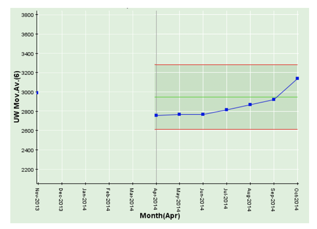
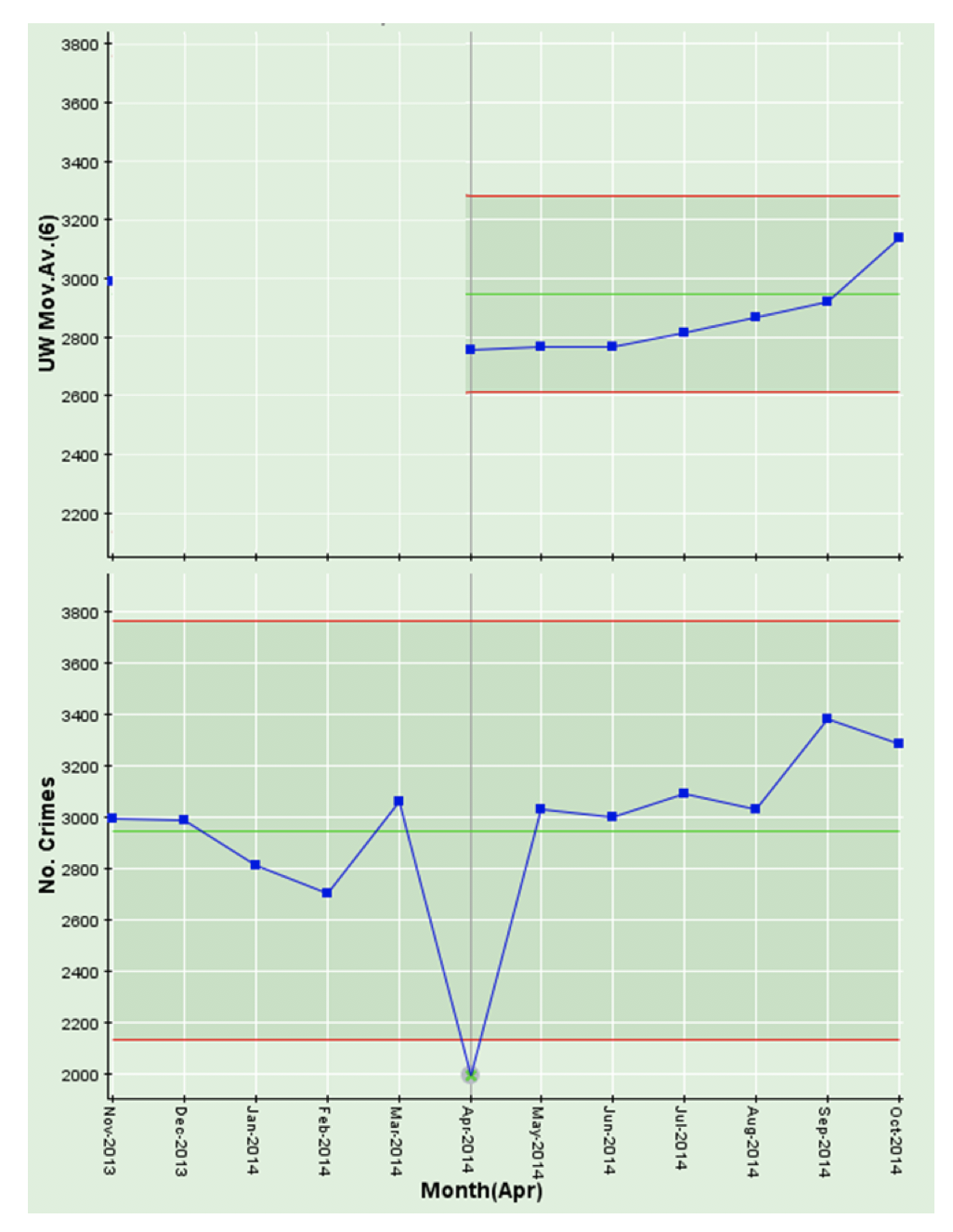
The critical thing to note is that more often than not, these moving average charts are presented out of context (i.e. without a chart of the underlying data). And this is the main problem as we’ll see below. But first, let’s explain the chart.
The chart above is an (unweighted or simple) 6-month moving average. The first point on the 6-month moving average is 6 months in, since, obviously, it needs 6 months (November 2013 through April 2014) to calculate a 6-month moving average for April 2014. The 6-month moving average for May 2014 is calculated from December 2013 through May 2014, the 6-month moving average for June 2014 is calculated from January 2014 through June 2014 and so on.
You’ll note that the latest result in October 2014 is the highest in the series of points. It might get some people excited about trying to find the cause of this. But let’s have a look at the underlying data – and we might draw a different conclusion.
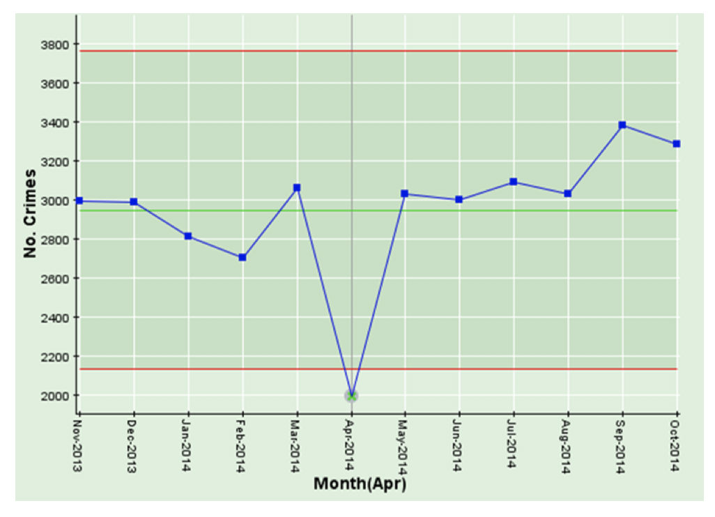
This chart is a simple time-series chart of crimes per month from November 2013 through October 2014. Note the significant drop in April 2014!
You’ll note that the last month (October 2014) on the time-series chart below is not unusually high, but, as we saw above, the last result in the moving average chart is the highest of any of the previous 6 results. This is not because October 2014 is unusual, it is because the calculation for October 2014 6-month moving average uses May 2014 through October 2014, and the very low result of April 2014 has dropped out of the calculation. We have observed in our travels, that these spurious “highest results” (or the opposite “lowest results”) can get people pretty agitated and can kick off wasteful investigations around what happened in the latest month, when, in fact, the issue was, in this case, 6 months earlier!
Our recommendation is, in order to maintain context, you ALWAYS display moving average charts (or any other kind of sophisticated statistically treated measure) with their corresponding time-series chart.
That would keep Dilbert happy!
We’ll use the next and final part in this series, to look at statistical representations of populations and when they are useful and when they are not! Dilbert would be super-impressed!
Categories & Tags:
Leave a comment on this post:
You might also like…

Building more than research: Reflections from the ECRn Symposium 2026
There’s something quietly powerful about a room full of early career researchers. Not just the ideas, although there were plenty of those—but the conversations, the curiosity, and the sense that everyone is figuring things ...

Library services over Easter, 3-6 April
Kings Norton Library will remain open for study 24/7. You will need your University ID card to enter the building and can use the self-service machines to borrow and return items as usual. Barrington Library ...

How do I access the full-text of Harvard Business Review (HBR)?
This is a frequently asked question, and it's worth knowing how to access this key management journal. So, how do you access HBR in full-text? The short answer is via our eJournals finder. You can find ...

Engineering problem to solve? Let Knovel help you find a solution
Did you know that Knovel provides you with more than just eBooks? Knovel is a key database for many engineering, mechanical and materials courses here at Cranfield University, and contains content from an extensive range ...

What happens when female scholars meet influential leaders?
On the 5 March 2026, our British Council Women in STEM Scholars had the privilege of sitting down with two excellent role models of industry and academia: Professor Dame Karen Holford, ...

From MSc to CEO: Igniting a research revolution
For many, a master’s degree is achieving a big milestone. Kilyan Ocampo, Computational Fluid Dynamics alumni shares how studying at Cranfield helped launch his career in the energy sector. Today, Kilyan ...