


Performance Reporting Measures vs Performance Management Measures – Part 3
08/01/2020

Pass-Fail (Or are they Fix-Fail?) Measures
You may have read my previous blogs comparing Performance Reporting Measures vs Performance Management Measures.
Performance reporting is littered with measures that may appear to carry meaning for some people, but in our observations, have been misleading and impenetrable to many. And certainly don’t help understanding nor how to improve!
Here are some examples of reporting measures that we introduced previously:
- % items completed: % implies a ratio – with a numerator and denominator. E.g. % Repairs Completed defined by (Number of Repairs Completed / Total Number of Repair Calls) * 100
- % completed within some timeframe: E.g. From a previous blog’s A&E Figures, we saw % A&E attendants seen in 4 hours or under.
- Complicated Measure Combinations: E.g. % Forecast Accuracy in Supply-chain
- Applying sophisticated statistical treatment to raw performance measures that only stats specialists can read: E.g. Exponentially weighted moving averages
- Statistical representation of a population of people or things: E.g. Electric Car Use by Country
This week we’ll look at % completed within some timeframe (or % of a population meeting some constraint / target). Examples are: % A&E Attendants seen in 4 hours or under; % Calls Answered within 15 seconds; % Trains Arriving Within 5 minutes of Schedule; % of Chocolate Bars Above A Target Weight. You’ll probably have some examples of your own.
So we already know from the previous 2 blogs on this subject that % measures present problems which we will not revisit here.
So if “% A&E Attendants seen in 4 hours or under” is a performance reporting measure, what is a the equivalent performance management measure? It’s “Throughput Time from Arrival to Admission, Transfer or Discharge” (using the NHS England A&E Attendances and Emergency Admissions Monthly Return Definitions, November 2015). For brevity we’ll just call this Throughput Time – and this is the equivalent to all those % success within Timeframe measures above. Regarding Target Weight Measure above – just measure Chocolate Bar Weight.
For those who have followed our blogs over the past few years, you will understand that one of the biggest problems in managing business processes is variation. It would be very rare to get the same number of people coming into A&E every day of the year. It would be very rare for every one of them to be seen and assessed in exactly the same time in every case. You can learn an awful lot about how well a business is performing by looking at the variation over time in the performance management measure – Throughput Time.
The problem is, it is impossible to get any national statistics around A&E Throughput Time! So we’ve shown some charts from a different context – around biological products delivered to a Health System to illustrate the power of being able to examine Throughput Time:
Issue No. 1: No Understanding of the System or Process Capability:
- % Attendants Seen <= 4 Hrs:
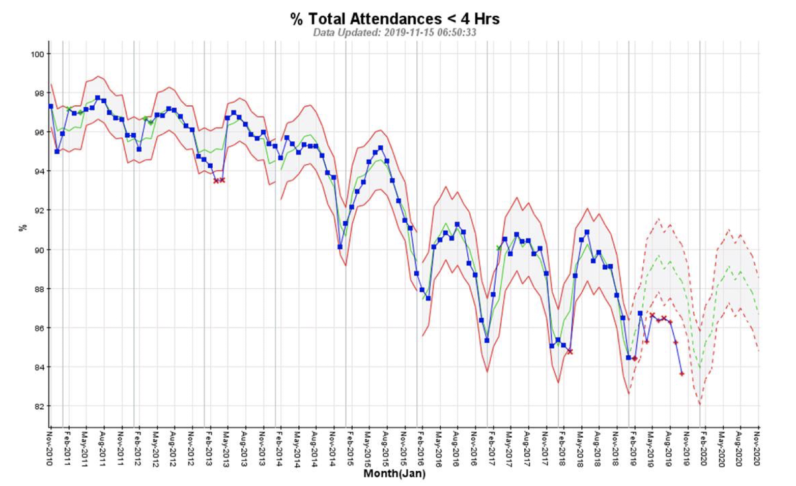
This measure is a Pass-Fail measure. You’re either seen in 4 hours or under (Pass), or not (Fail).
All you can see from the chart above is a worsening of Pass-Fail ratio. It does not answer the more important question for the customer (patient) – how long is it likely to take?
We have no idea if most of the attendants in A&E are seen within 1 min (which is perhaps fantastic) or 3 hrs 59 mins (perhaps inconvenient).
There is a Pass-Fail measure around 12 hrs as well, but again we have no idea if most of these customers (patients) are seen in 4 hrs 1 min (perhaps inconvenient) or 11 hrs 59 mins (perhaps problematic).
- Throughput Time:
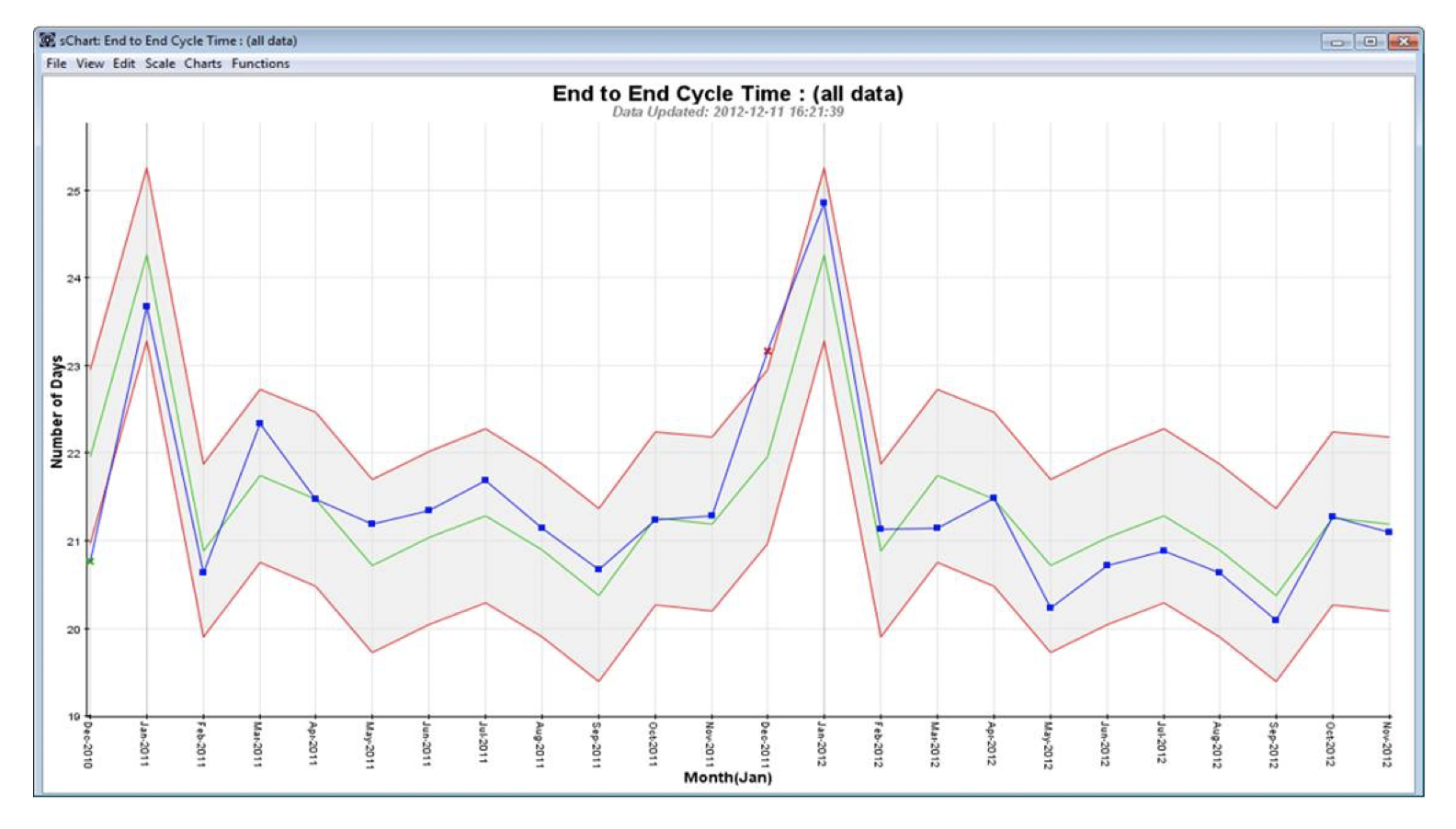
This chart shows Throughput Time for biological product delivered to a Health System. This is strongly seasonal with peaks around January. At this point, no more insightful than the previous chart above.
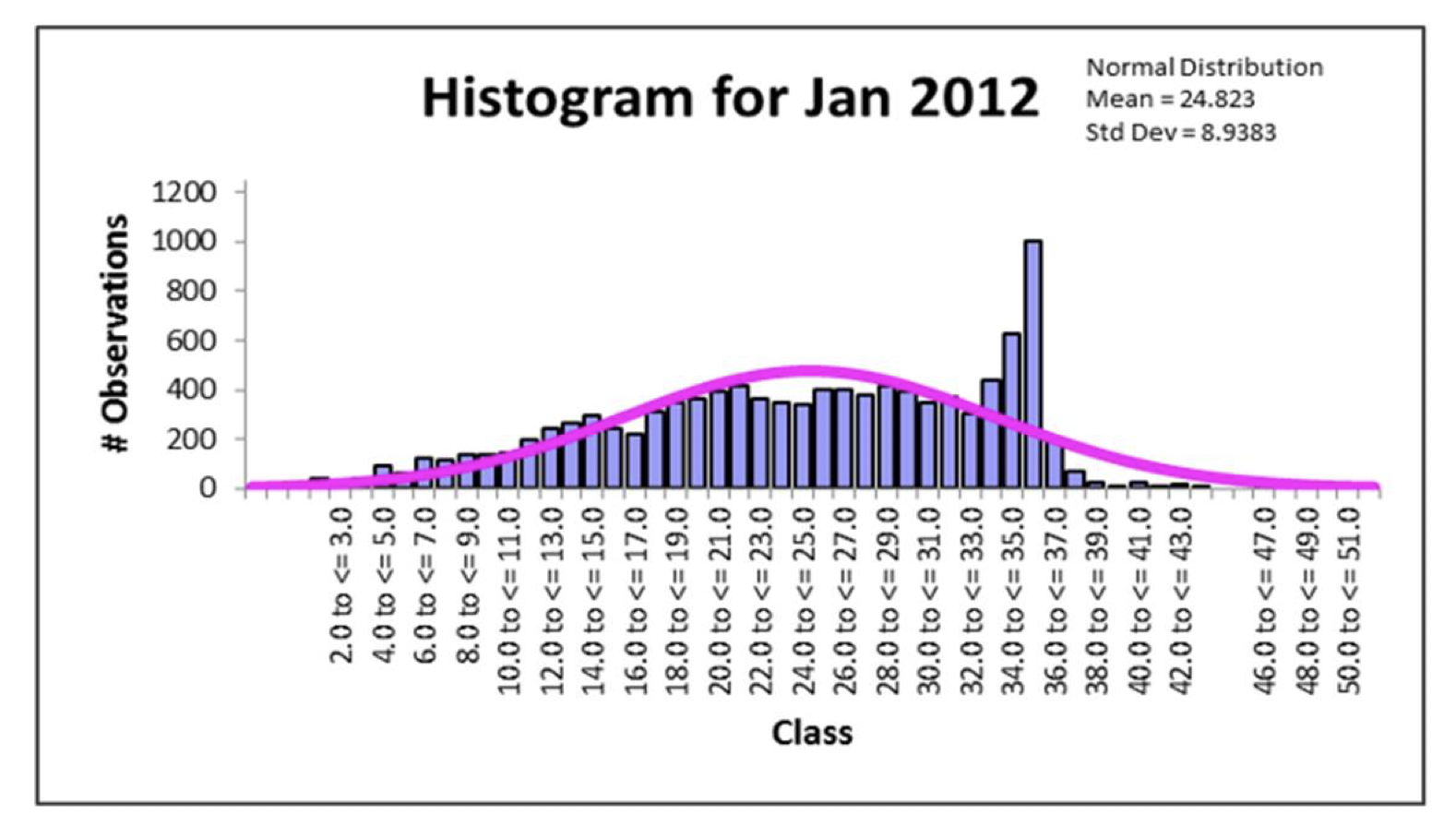
However, the Throughput Time chart is actually tracking the monthly average Throughput Time. Within each month there is a large degree of variation, which we can drill down into. Shown below as a histogram (in this case we have selected the month of January 2012):
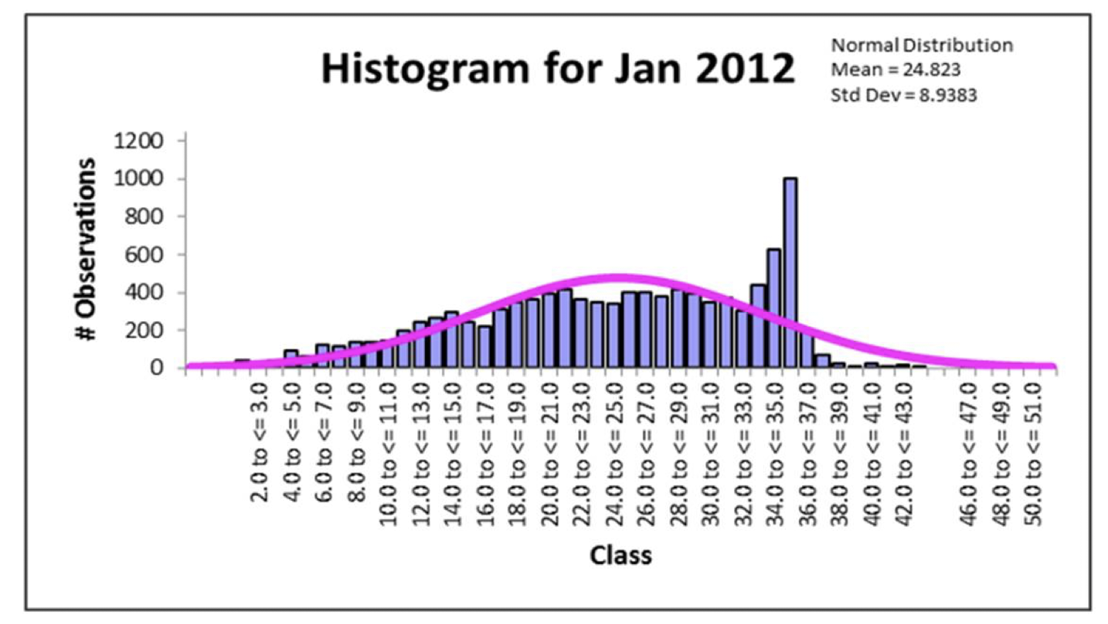
Now we have something useful! And the profile is likely to be similar to that of A&E Wait Times.
The vertical bars are the number of deliveries within a specific time-bucket ranging from 2-3 days to 50-51 days. The pink curve is the “ideal” (but see previous blog on Continuous Improvement) curve if the delivery process was not under stress.
In the chart above, we can see that there is a significant spread in delivery times from as little as 1 day to as much as 50 or more days. We can ask what is the cause of this spread (or variation), and drill down further?
In the chart above, we also see a huge spike just below and at 35 days – this is because the biological product has to be destroyed when older than 35 days. And it’s highly likely the A&E Wait Times also has a spike just under and at 4 hours. The size of this spike gives you the ability to see how much the system is creaking to deliver 4 hours and under Wait Times. If there was no (or only a minor) spike, it would mean the system was operating largely in control.
Issue No. 2: Drives some organisations to “play the system” by “fixing” results:
- % Attendants Seen <= 4 Hrs:
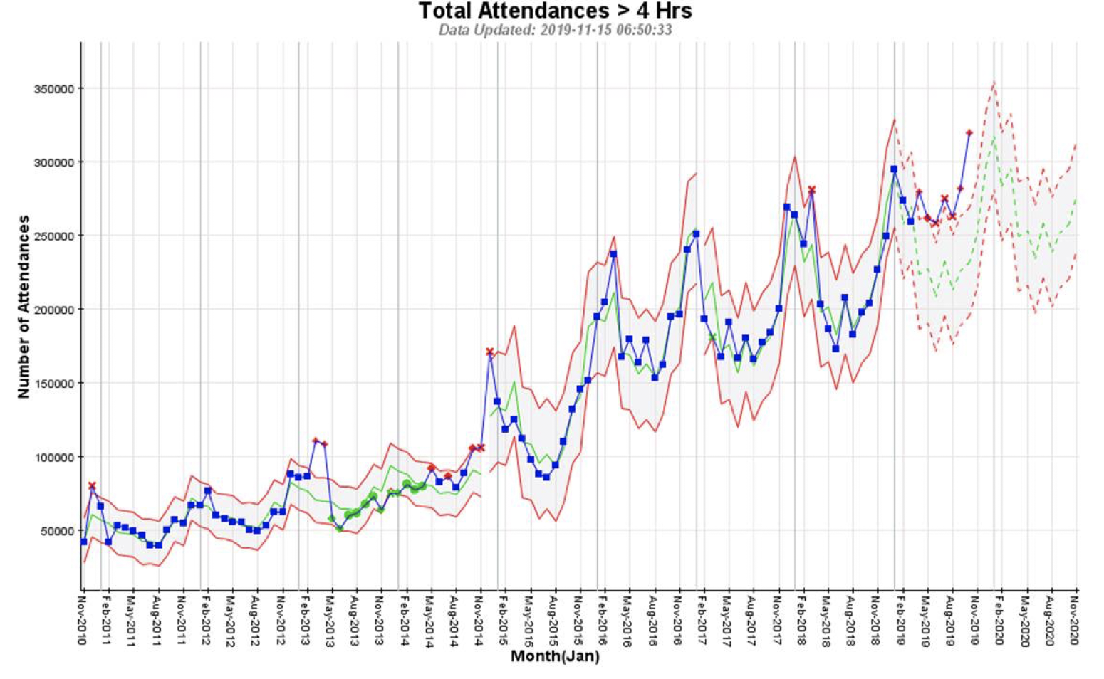
The only other useful-ish chart we can get out of this reporting measure is the Total Attendances with Wait Times greater than 4 hours. This is of course increasing seasonally with winter peaks.
You have no idea how many attendants waited more than 4 hours because A&E decided there was no chance of achieving target (in this case 95%), and so left the attendant for longer than necessary in order to push others through which they knew would be much easier/faster to handle.
- Throughput Time:
When you see this kind of spike indicating a system under stress, it is highly likely there will be some gaming going on to hit the target.
Instead, by drilling down, you can start to determine drivers of this spike, and then work on corrective action.
Issue no. 3: Does little towards improving customer (patient) experience:
- % Attendants Seen <= 4 Hrs:
Ideally, you’d want to start drilling down, say, by hospital, by cohort (dependent on e.g. attendant age group, location, socio-economic group, etc.), by problem type etc. This would be to understand where to focus improvement effort first.
But we saw from a previous blog on this subject, that drilling down into %’s can give some highly unpredictable results.
- Throughput Time:
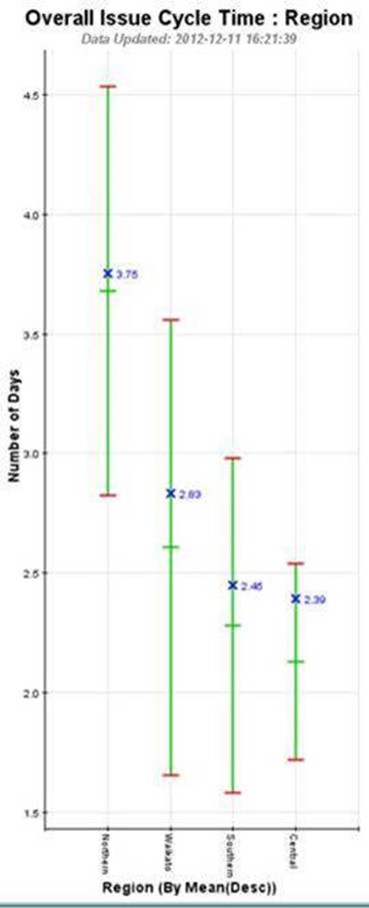
Here we can safely drill down to establish drivers (in this case by Region) of extended Throughput Time (in this case the Region on the left – Northern), and continue drilling down further by geography, or by other characteristics, to enable specific improvement action to be taken / tested.
Another performance management measure is Work In Progress (or stuff stuck in the business process or system). In fact, WIP drives Throughput Time. In A&E the equivalent of WIP are the people sitting waiting in seating areas, people waiting on trolleys in corridors etc. But we’ll look at WIP another time. It would definitely pique Dilbert’s interest!
And next time in this series, we’ll look at complicated measure combinations. The example will be from supply-chain and you’d be flabbergasted if you knew how much resource, in one organisation, this measure consumed without an iota of meaningful understanding coming from it! Dilbert would have a field day!
Categories & Tags:
Leave a comment on this post:
You might also like…

Building more than research: Reflections from the ECRn Symposium 2026
There’s something quietly powerful about a room full of early career researchers. Not just the ideas, although there were plenty of those—but the conversations, the curiosity, and the sense that everyone is figuring things ...

Library services over Easter, 3-6 April
Kings Norton Library will remain open for study 24/7. You will need your University ID card to enter the building and can use the self-service machines to borrow and return items as usual. Barrington Library ...

How do I access the full-text of Harvard Business Review (HBR)?
This is a frequently asked question, and it's worth knowing how to access this key management journal. So, how do you access HBR in full-text? The short answer is via our eJournals finder. You can find ...

Engineering problem to solve? Let Knovel help you find a solution
Did you know that Knovel provides you with more than just eBooks? Knovel is a key database for many engineering, mechanical and materials courses here at Cranfield University, and contains content from an extensive range ...

What happens when female scholars meet influential leaders?
On the 5 March 2026, our British Council Women in STEM Scholars had the privilege of sitting down with two excellent role models of industry and academia: Professor Dame Karen Holford, ...

From MSc to CEO: Igniting a research revolution
For many, a master’s degree is achieving a big milestone. Kilyan Ocampo, Computational Fluid Dynamics alumni shares how studying at Cranfield helped launch his career in the energy sector. Today, Kilyan ...